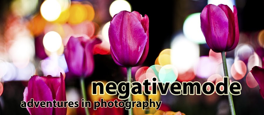
Not really. But as you can see, I've changed the look of NegativeMode slightly. While the original graphic on the top of your screen was nice and all, everyone else who chose this template when starting their blog had the same exact thing. That doesn't fly for NegativeMode. We, as you should be well aware, are not everyone else. NegativeMode is a diamond in the proverbial rough. While you, my loyal readers already know this, the rest of this cyber world does not. So I will continue to tweak, prod, and poke at NegativeMode until it is the absolute best that it can be. If you have any suggestions (both real and smart-assed), I welcome them all. When this thing takes off, just watch out.
SideNote: You may have thought that charcoal sketch was pretty snazzy PortMcClellan, but tell me, how you gonna top NegativeMode's new header? Oh, it's on. . . .
Tuesday, May 03, 2005
Subscribe to:
Post Comments (Atom)


4 comments:
I am thoroughly blown away by the new headbanner. I must get one for myself. Dare I say the multiplicitous picture bears some resemblance to a fro-ed-out First Officer Dunn?
You dare! Thank you for the praise. It makes it all worthwhile. Perhaps after finals, I can see what I can do as far as making a new headbanner for PositiveMode. Although NegativeMode and PositiveMode share their differences, a MODE divided against it self cannot stand. Plus, we should give ModeWatch something to talk about.
I dare say, you kind of look like Stalin.
-- The Port Master
Stalin --
The Port Master could also be known as your charcoal Nemesis.
-- West Side
Post a Comment